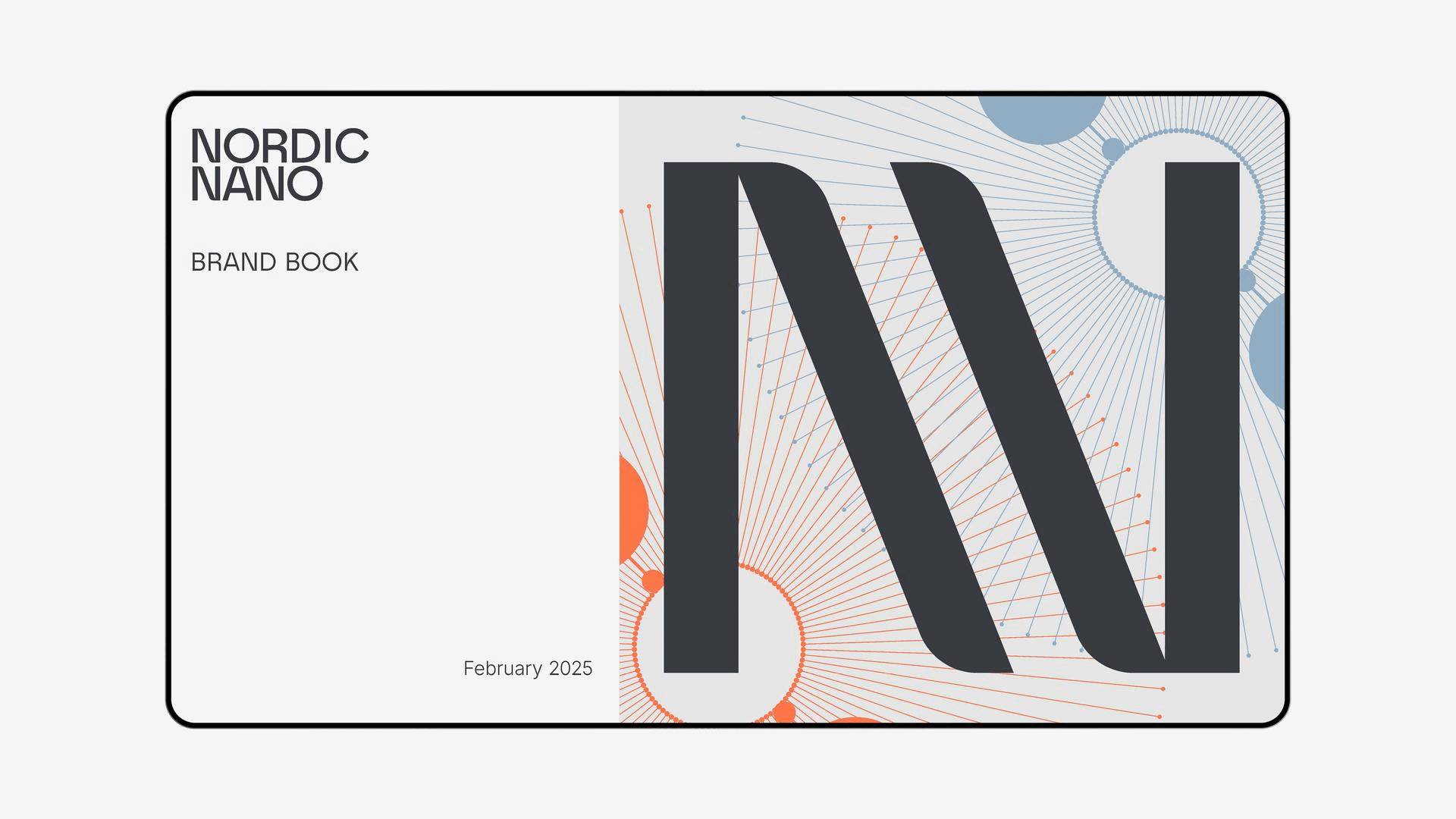
Nordic Nano
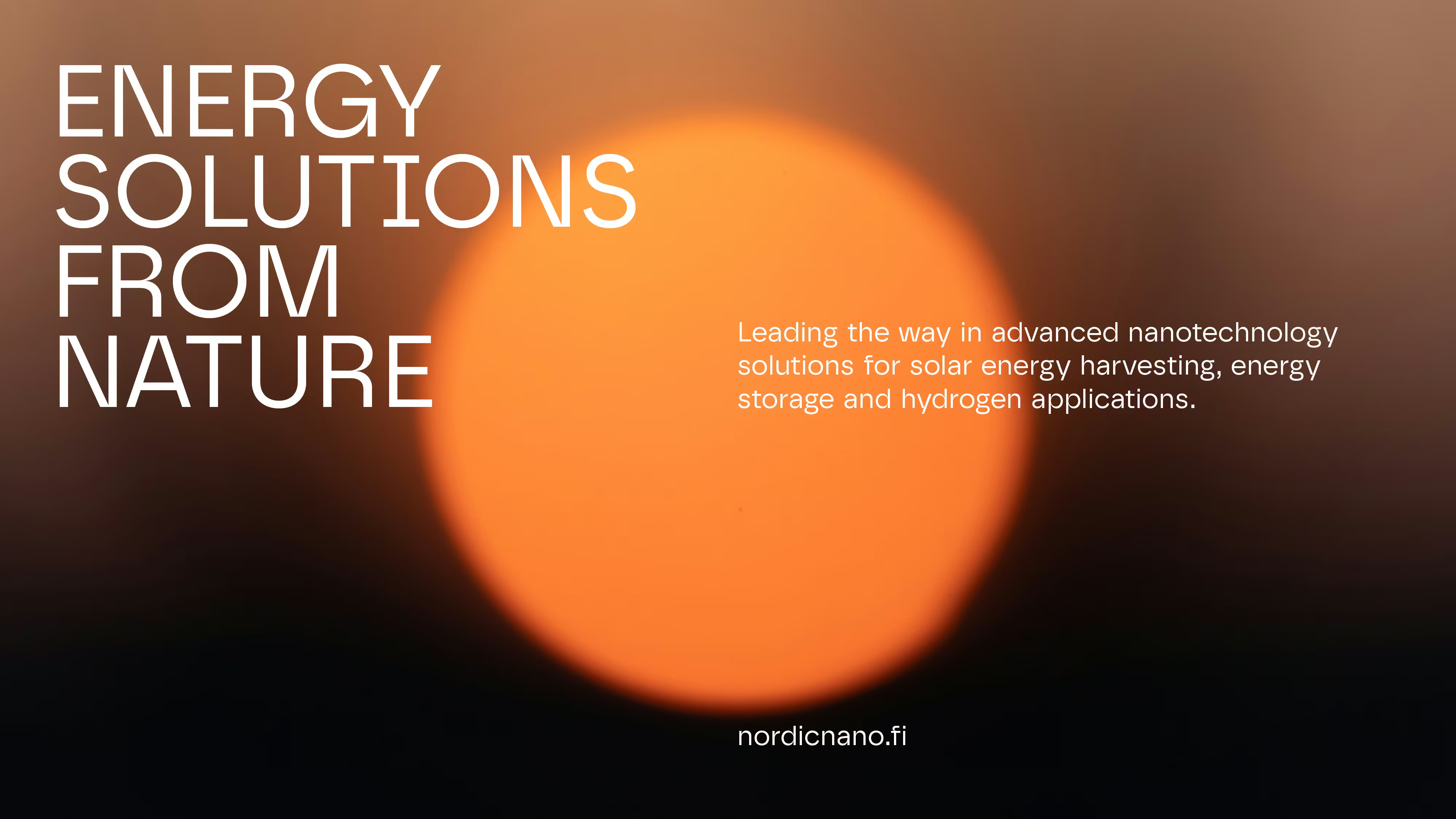
Illuminating the future of solar energy
Nordic Nano is a Finnish company pioneering sustainable solar energy solutions through advanced nanotechnology. Transforming how clean energy is harvested and stored, the company needed a clear brand story and new visual identity to match their ambition and global outlook.
Starting point
Nordic Nano’s existing identity lacked the clarity and impact to represent its innovation and also needed a way to present the nanotechnology at the core of their innovation. The brand required a unified, stand-out visual system that could connect scientific credibility with environmental purpose.
Approach
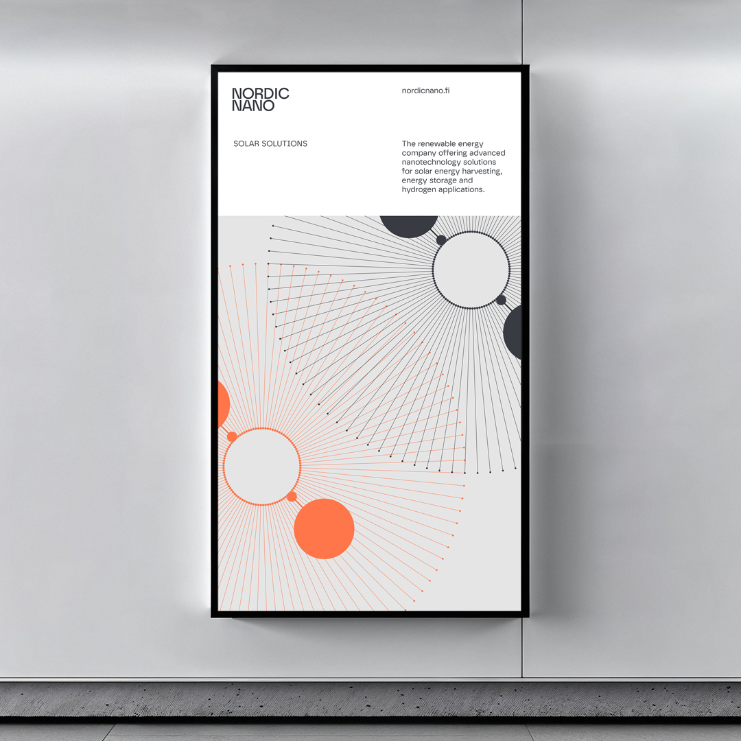
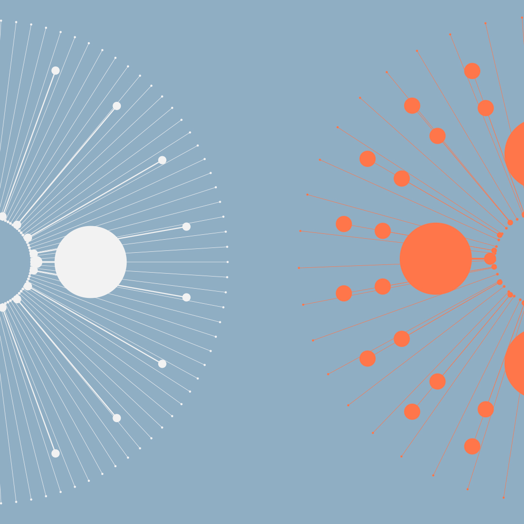
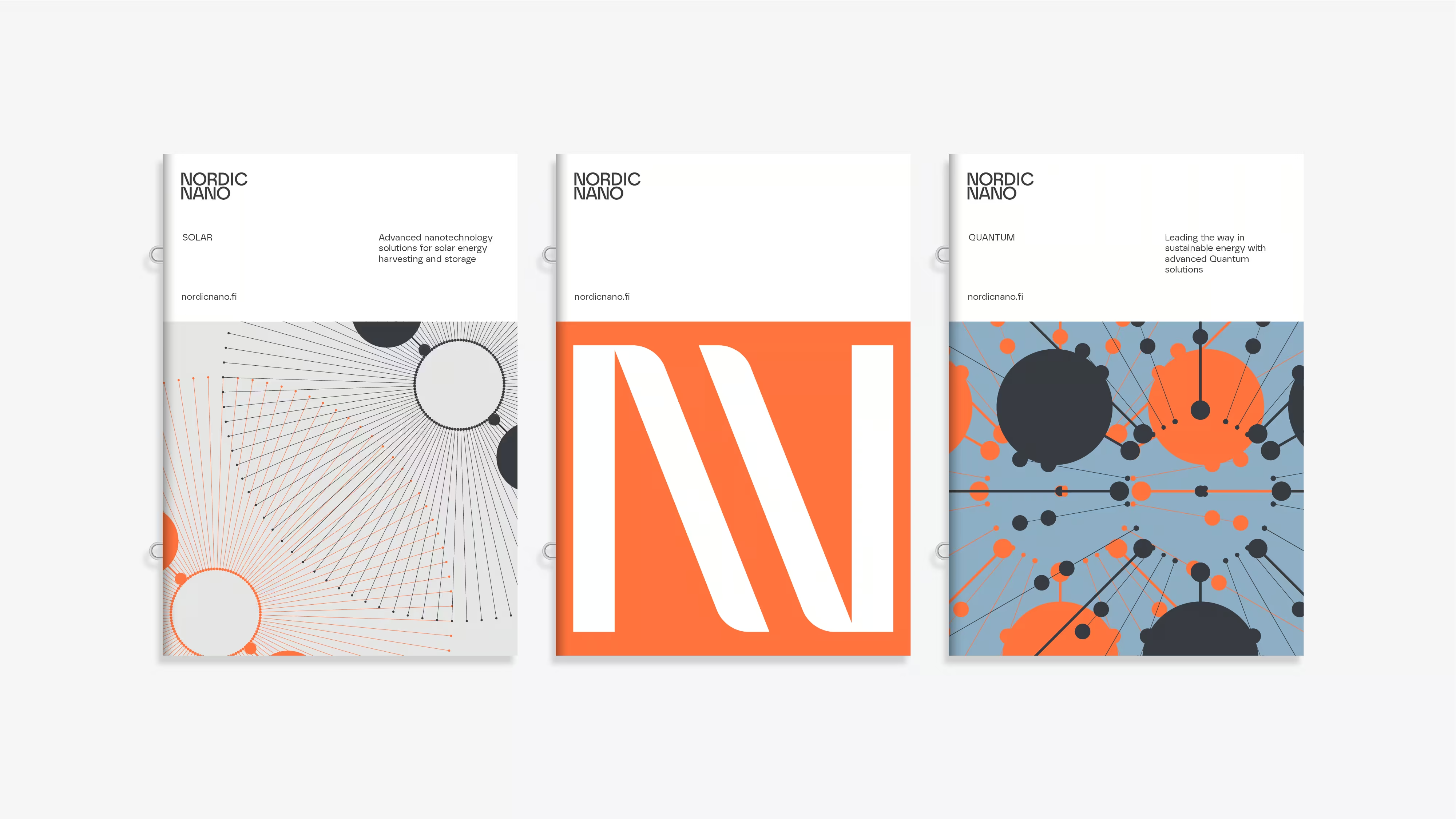
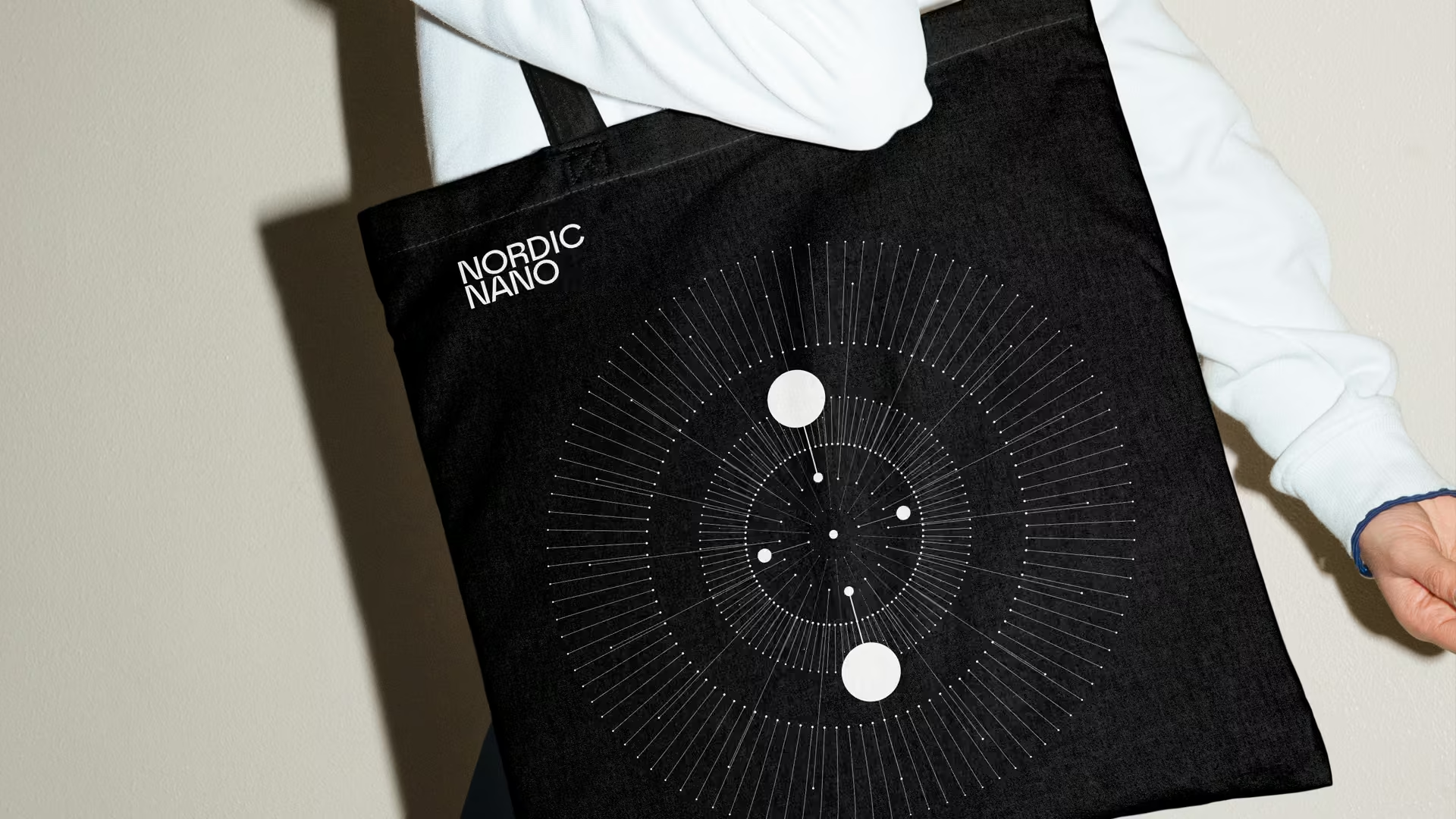
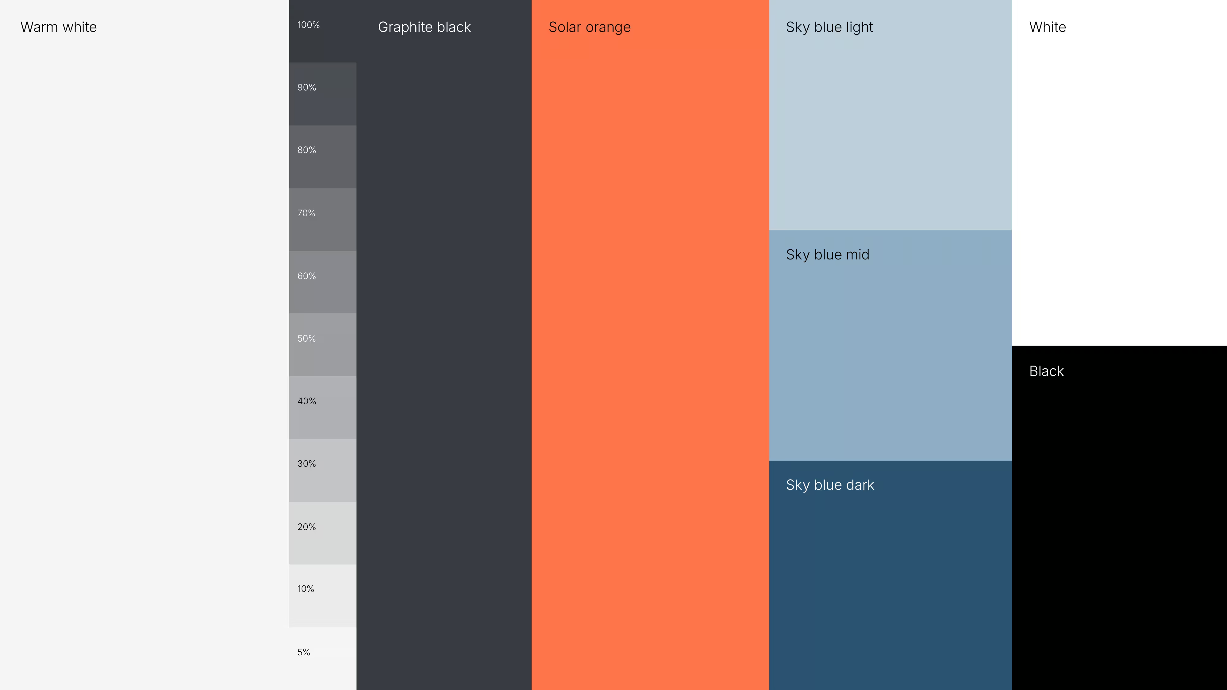
The new identity centres on clarity, precision, and innovation. A minimalist design language, anchored by a palette of Solar Orange and Sky Blue, evokes both energy and atmosphere. A sense of detail brought through typographic structure, with a dynamic Graphic Sun element brings cohesion and vitality across all brand touchpoints.
Impact
The refreshed identity positions Nordic Nano as a confident leader in sustainable technology. Its visual language now bridges science and responsibility to strengthen credibility, inspiring trust, and advancing the brand’s vision for a carbon-neutral future.
Awards
2026 GrandOne Shortlist (Best Design)
Collaborators
Awards
2026 GrandOne Shortlist (Best Design)


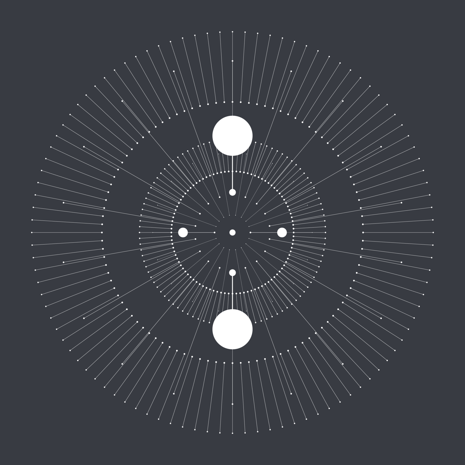
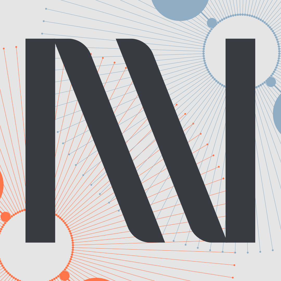
A system of scale and light
The graphic stars, constructed from fine keylines and circular nodes, form a flexible visual device that bridges the microscopic and the cosmic. Referencing both nano-scale particles and solar formations, they become a unifying identifier and illustrative layer across the brand.