The Train Factory
Injecting new life into an abandoned train yard
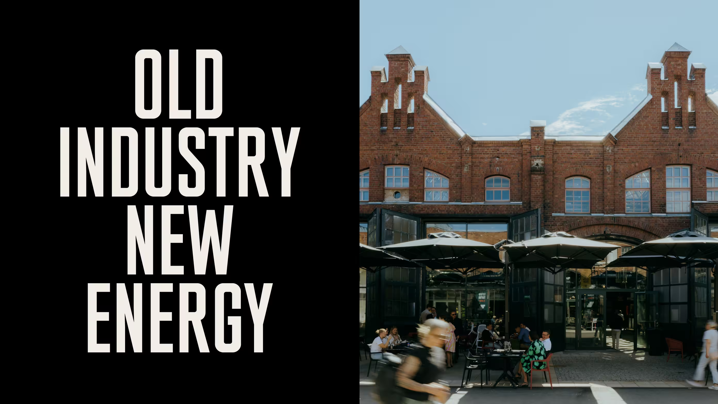
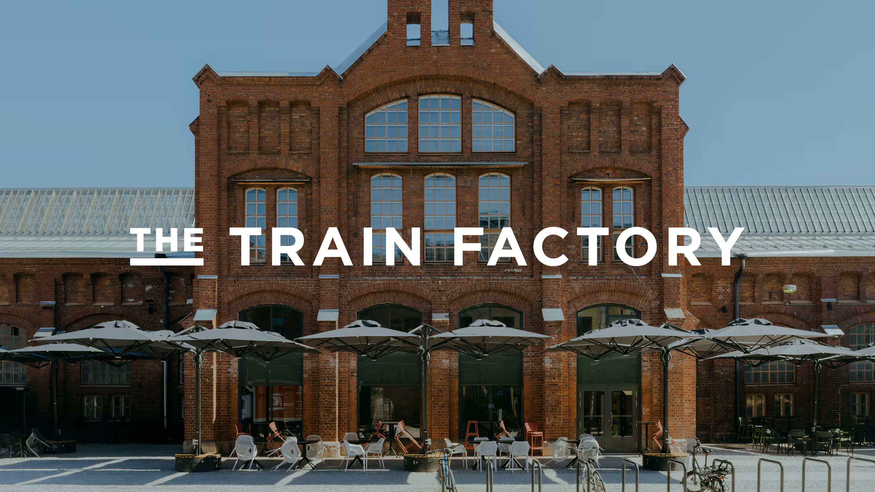
A comprehensive brand and visual identity for The Train Factory, a dynamic new food, sports and cultural destination built within a historic train manufacturing site in Vallila, Helsinki.
Starting point
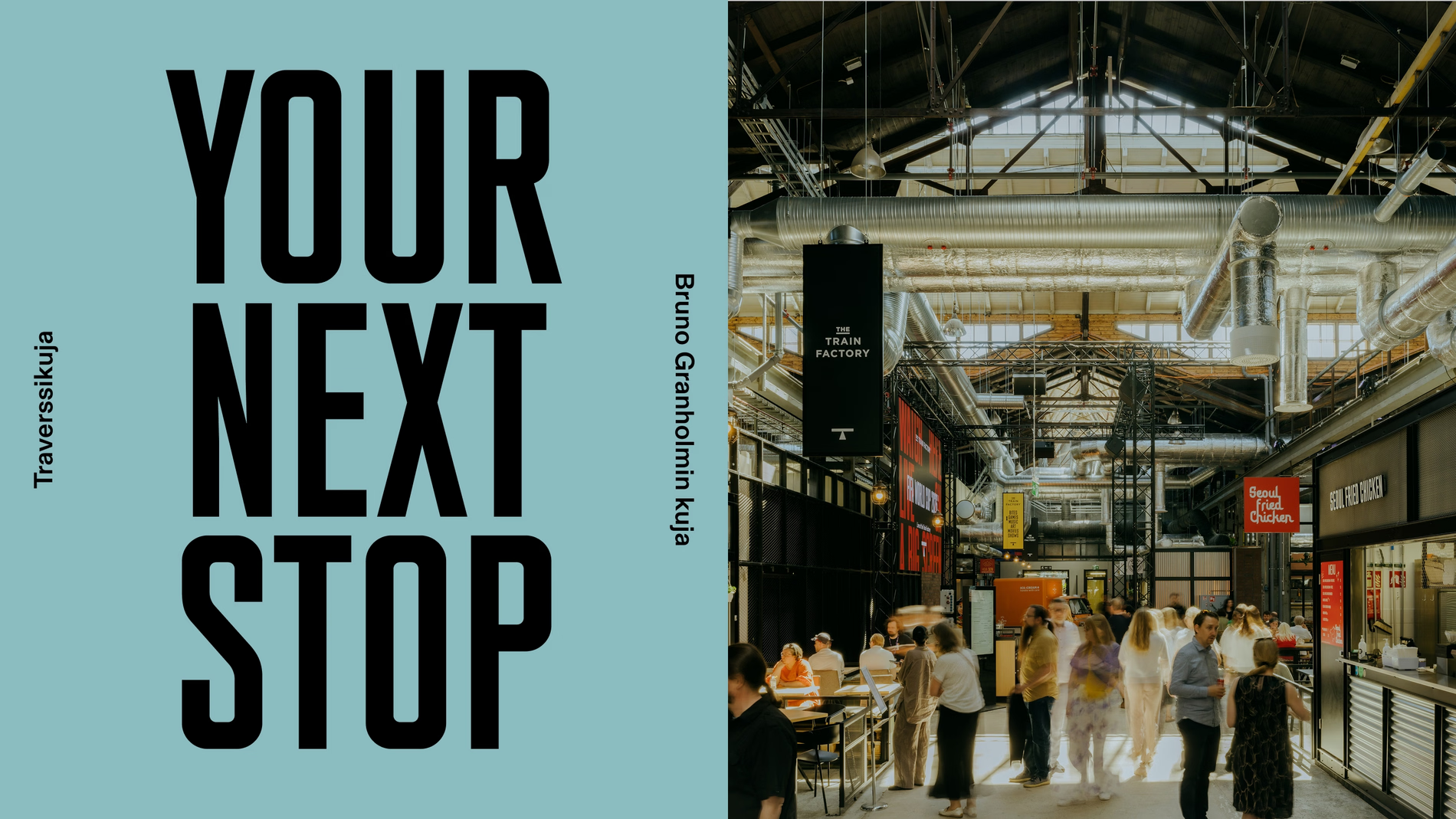
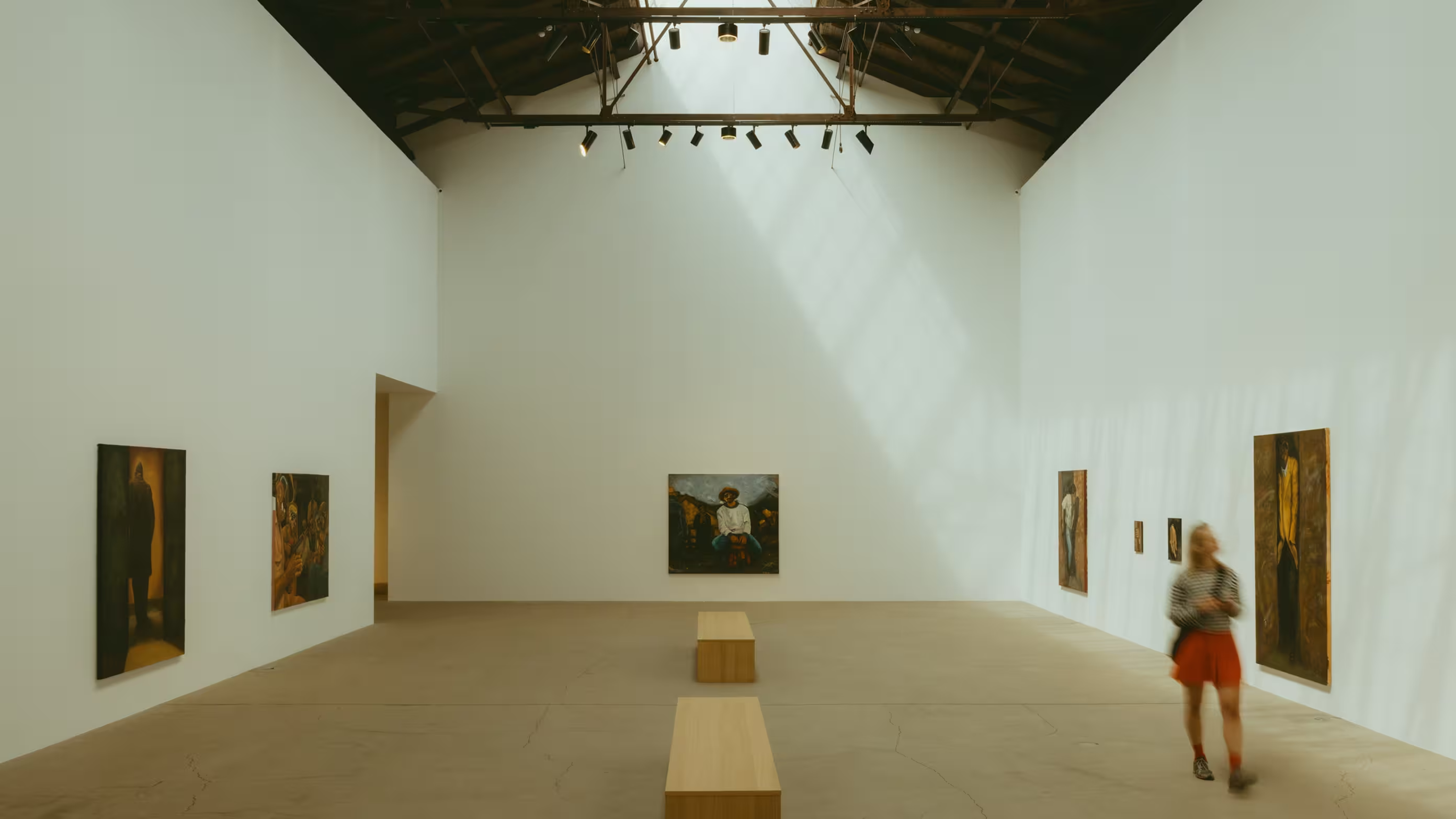
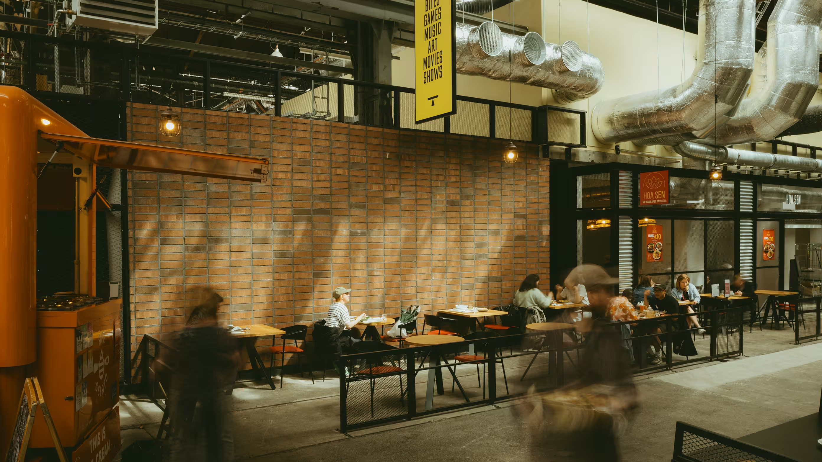
Repurposing the old to energise the new. The monumental space was once a bustling train factory where the majority of Finnish locomotives were manufactured. This historic site has been reimagined as a new venue for food, drinks, sports, and culture. Housing everything from modern dining to theatres and gallery spaces. The challenge was to create a brand platform that could honour the site's rich, hardworking legacy while establishing a vibrant, contemporary destination.
Approach
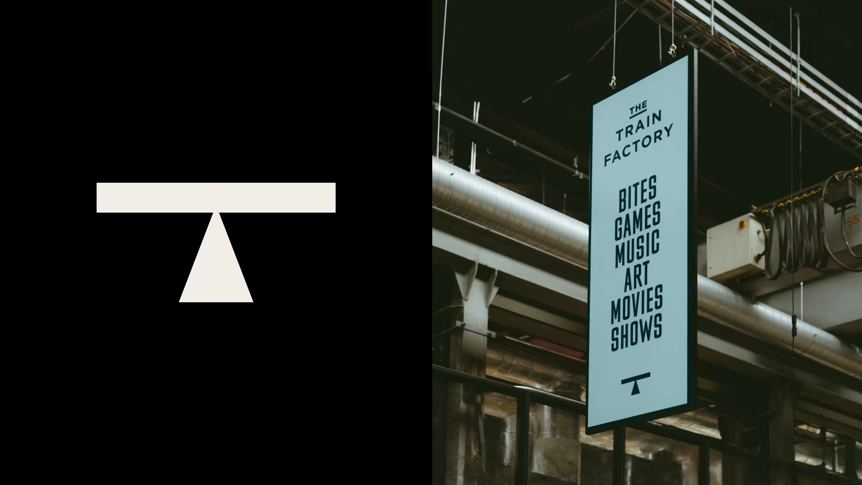
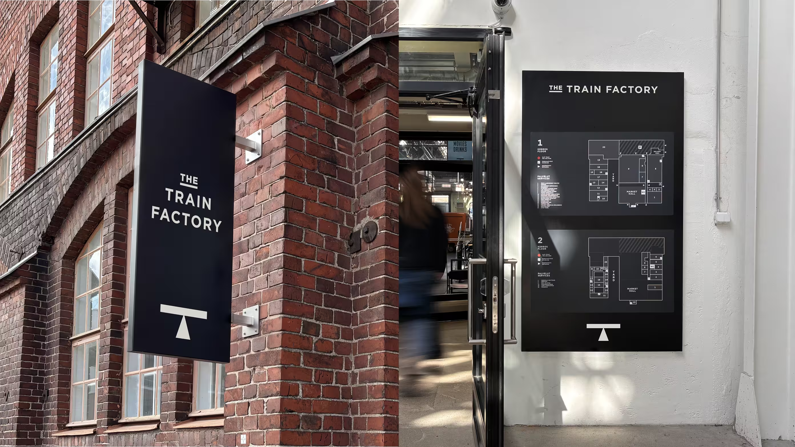
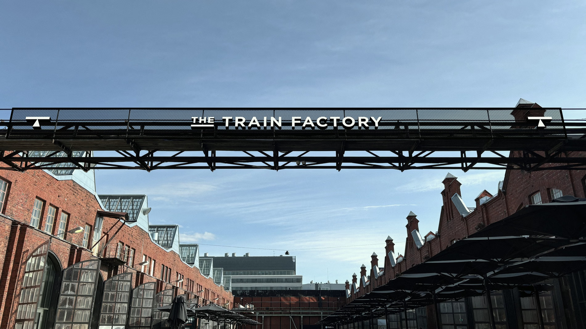
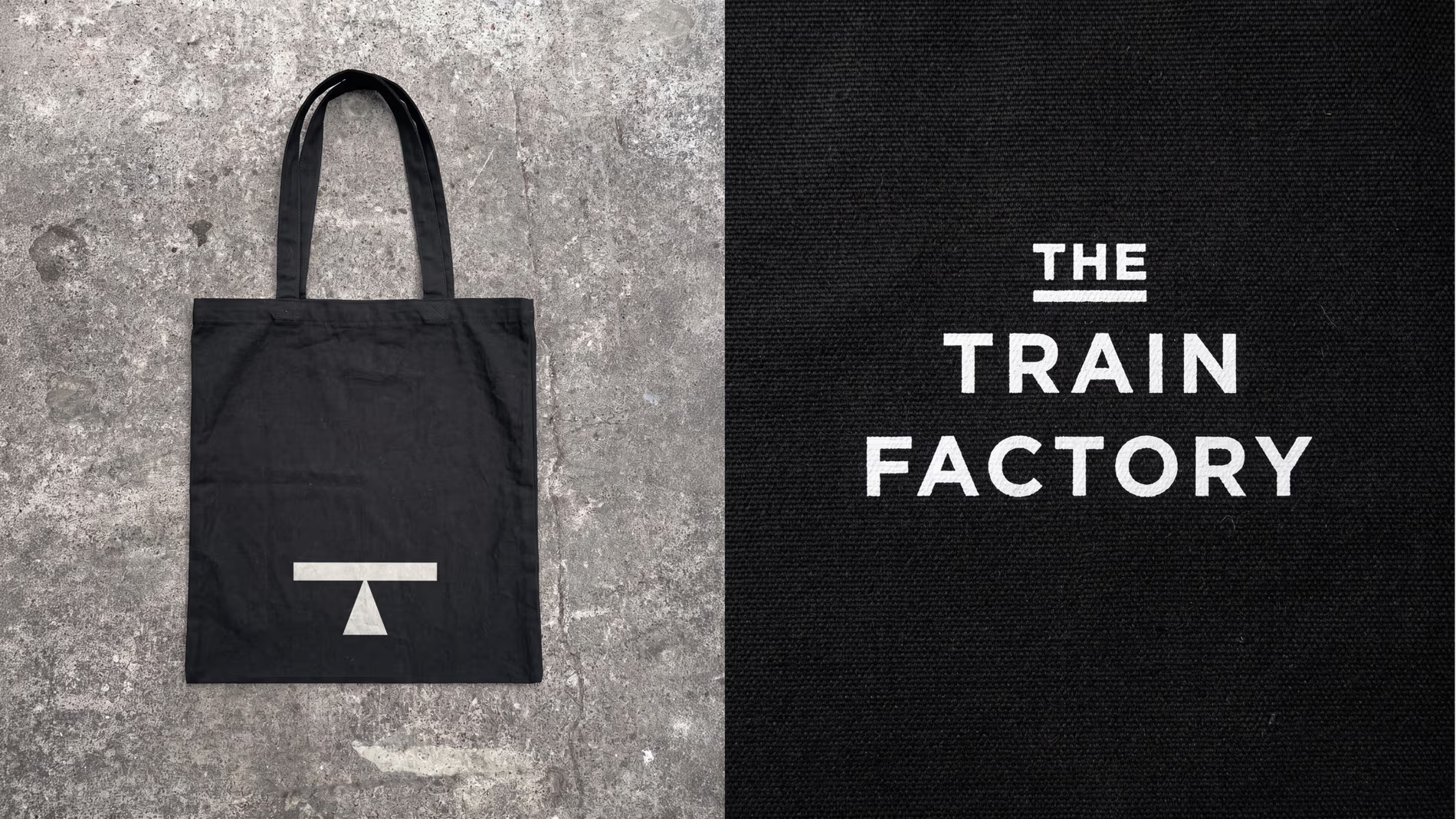
We felt strongly that the foundation of the new identity should stem from the history of the site but with a renewed intent. We discovered a functional, graphic symbol on the sides of train cars, indicating maintenance lifting points. We repurposed and redesigned this utilitarian mark into the brand's primary ‘T’ logo. This mark transforms a mechanical directive into a symbol of elevation, representing a platform for something new.
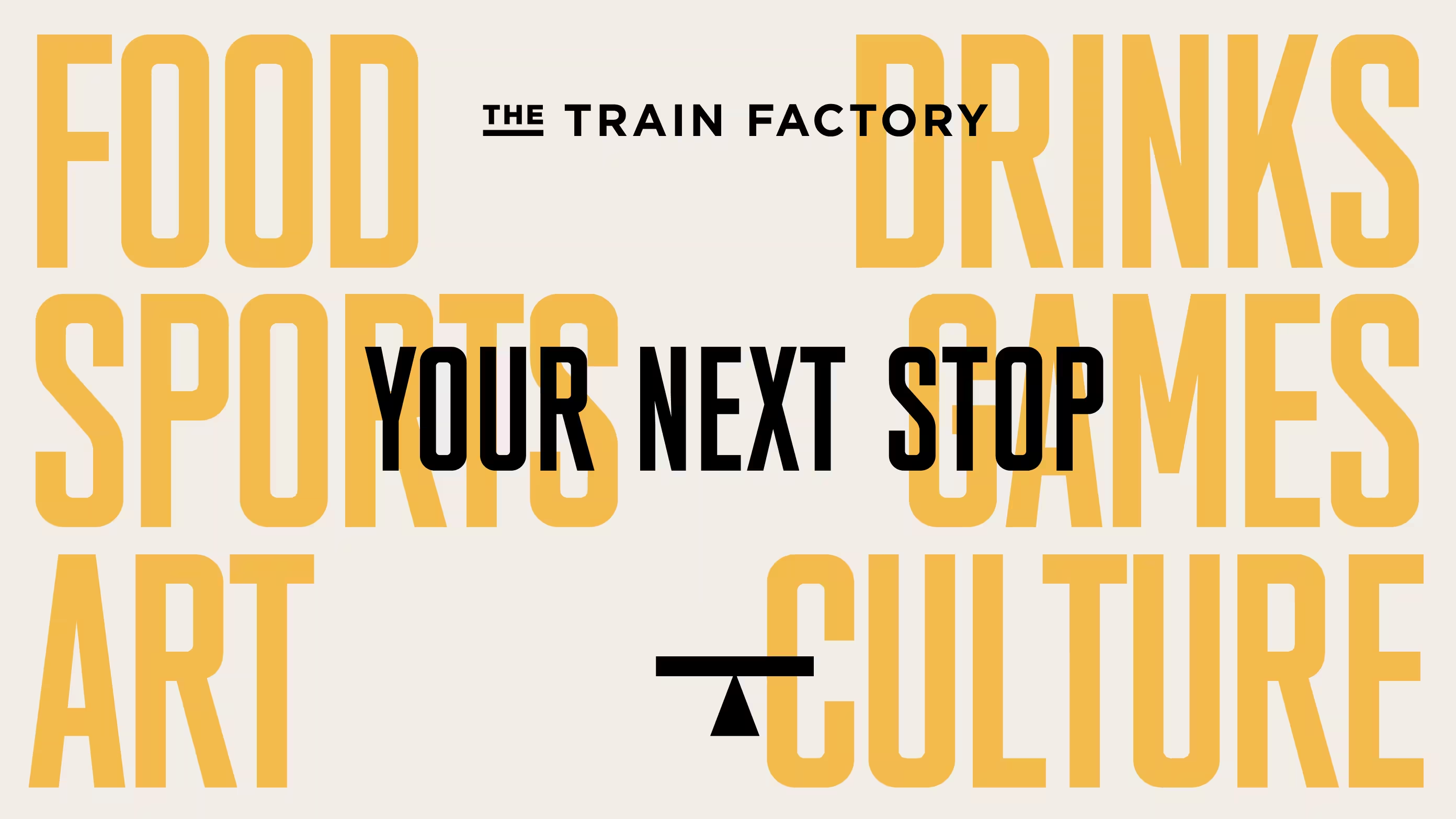
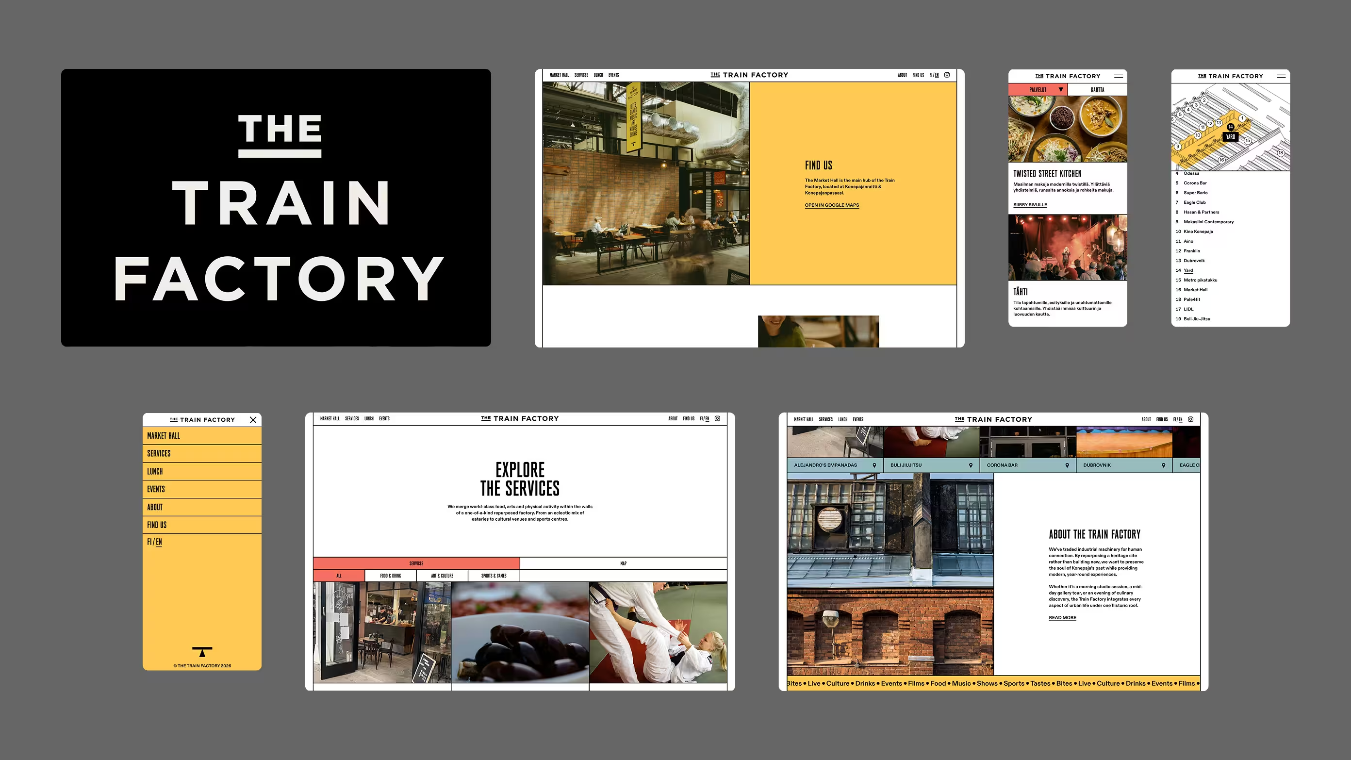
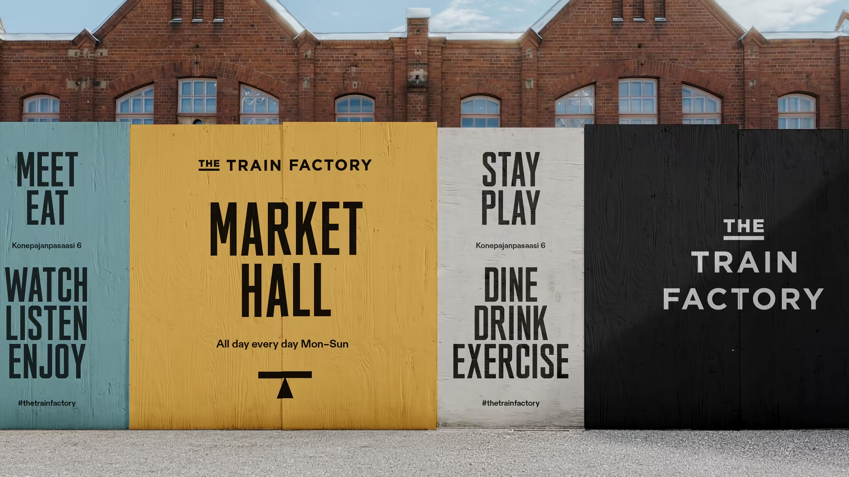
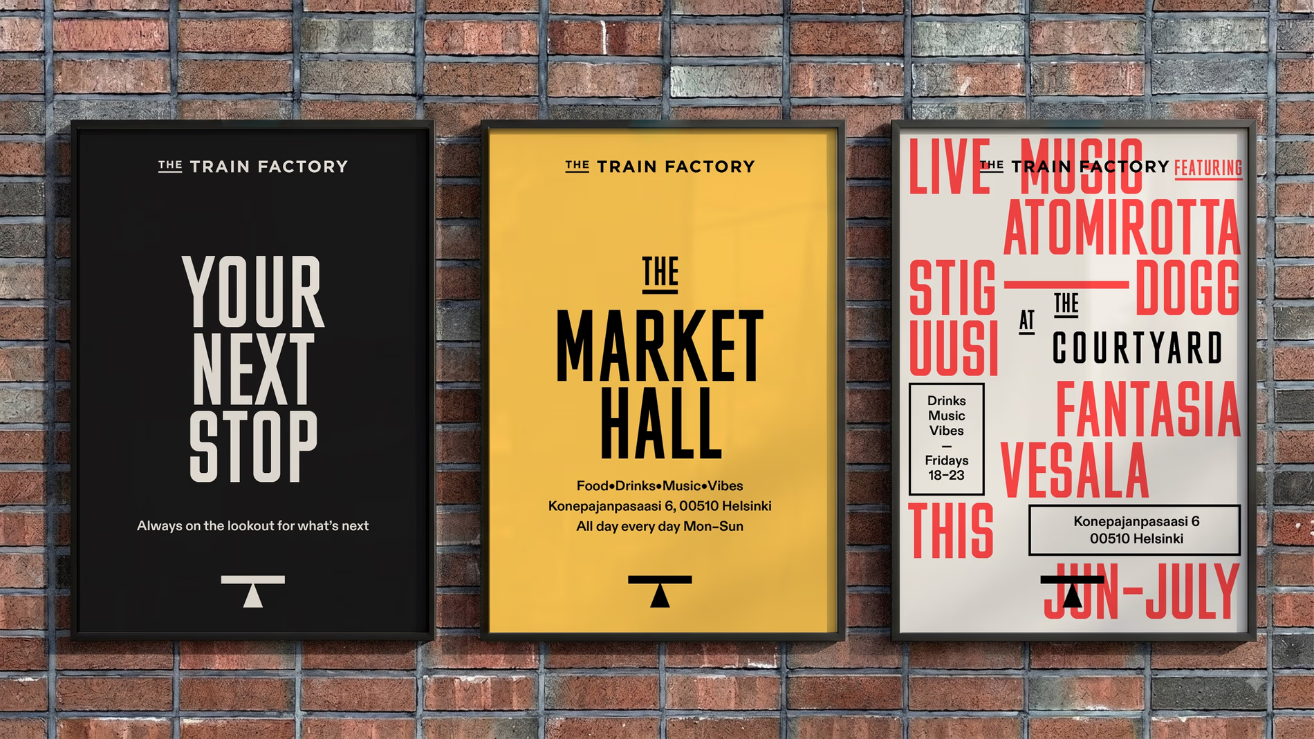
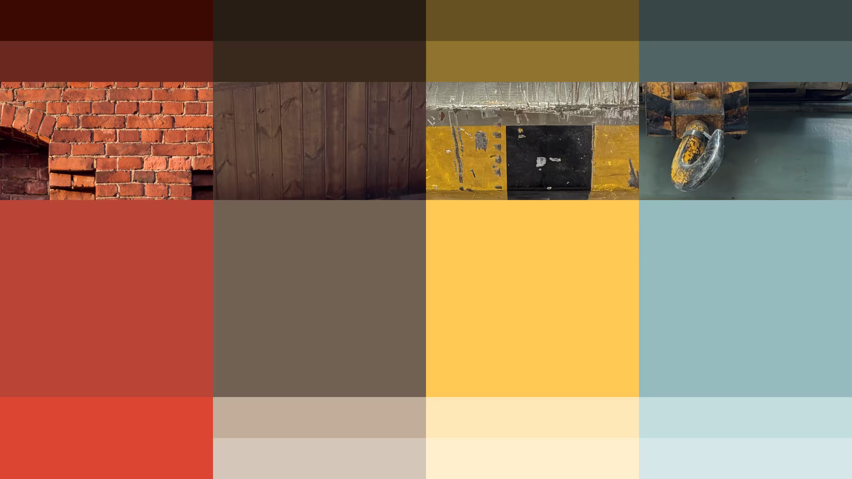
The logotype and signage styles take their inspiration from the Finnish train car numbering styles and are combined with a robust, industrial headline style. The colour palette is sourced from the building itself, the red of the iconic brick facade and accents of yellow and grey-blue pulled directly from leftover factory markings and the heavy cranes still visible within the space.
Impact
The result brings the legacy of the site back to life with a brand that references its industrial past through a new, lively attitude. By transforming a former manufacturing hub into Helsinki’s new cultural hotspot, supported by an identity built from its past but ready for what’s to come. The renewed brand identity has been featured in Creative Review, Creative Boom and Brand New.
Awards
Collaborators
Photography: Henri Vogt
Awards

Utility symbol, re-engineered
We discovered the logo hidden in plain sight: an industrial graphic on the sides of train cars to indicate heavy lifting points. Redesigned into a sharp ‘T’ mark, the symbol turns a mechanical directive into an emblem of elevation and a platform for new activity. The shape of the symbol also suggests the building’s triangular skylight profile.


From signage to screen
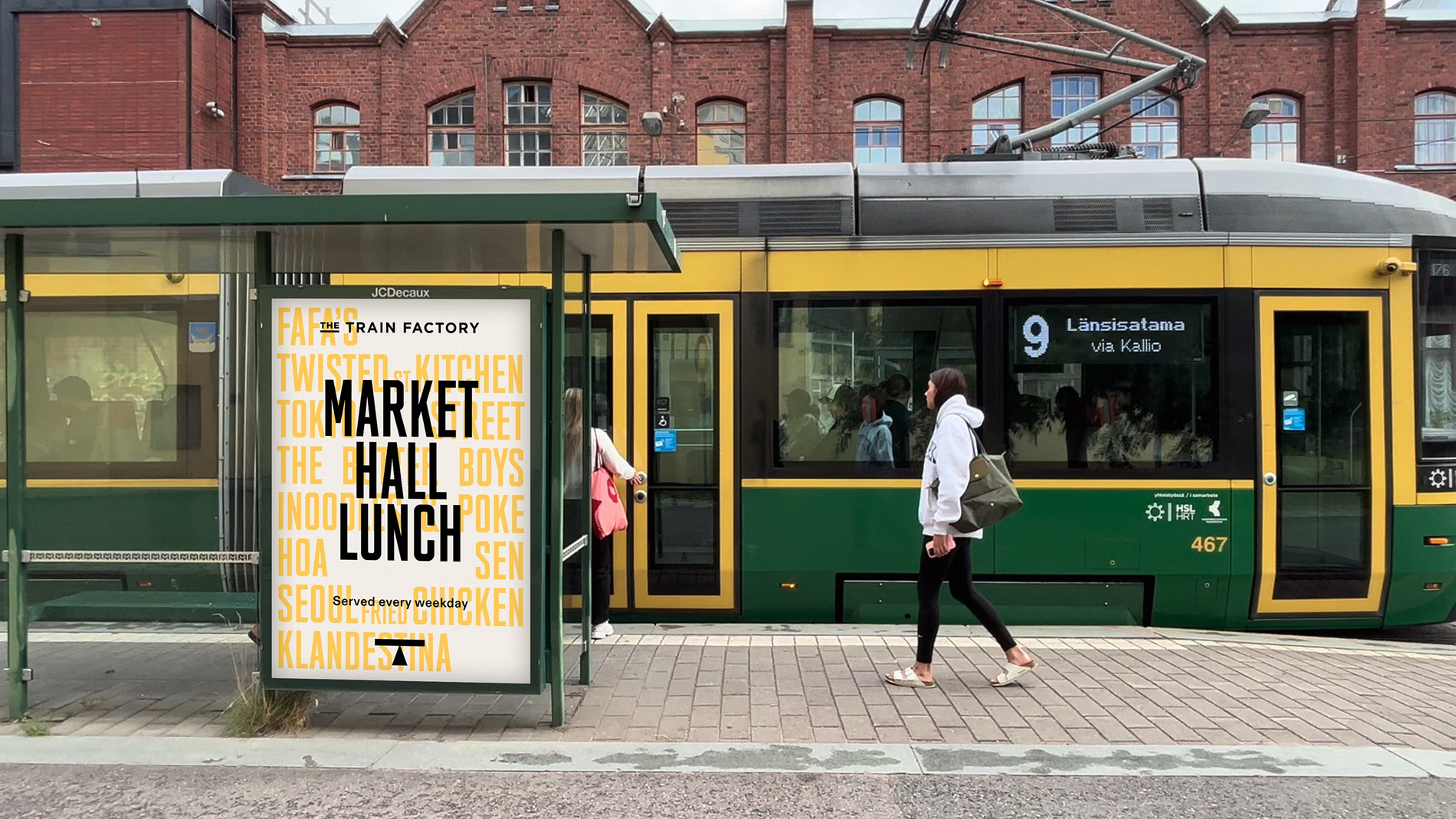
The brand was applied across way-finding, brand communication, social media and website. The line ‘Your Next Stop’ has a nod to train communication while inviting people in to eat, play, or explore.